Group plots
The top panel row in CellExplorer interface is dedicated to population level representations of the cells, and consists of three main plots shown below.
Table of contents
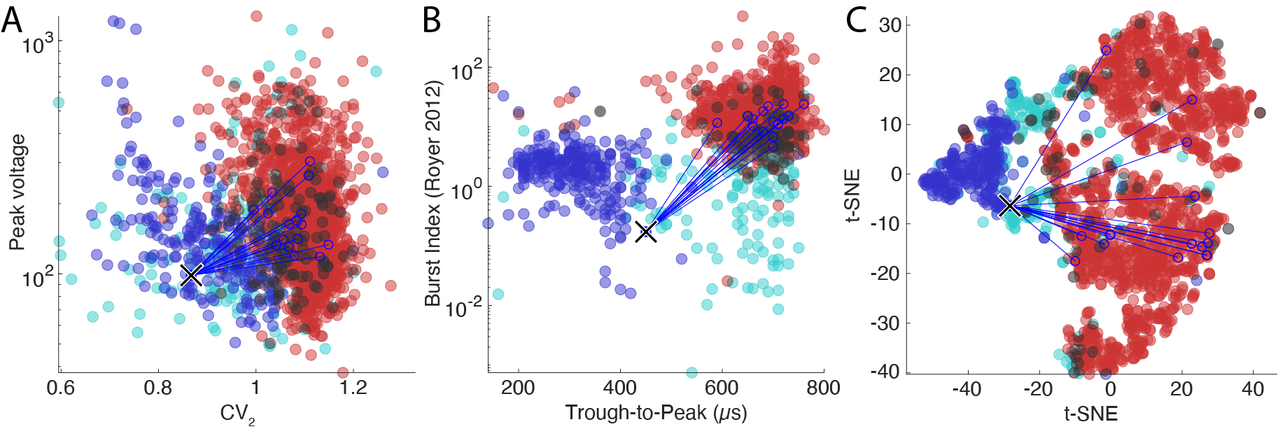 The figure above shows the three main population plots in CellExplorer. Each dot is a cell that is color coded by its putative cell type. The incoming synaptic connections are highlighted for a single cell with blue lines.
Custom group plot
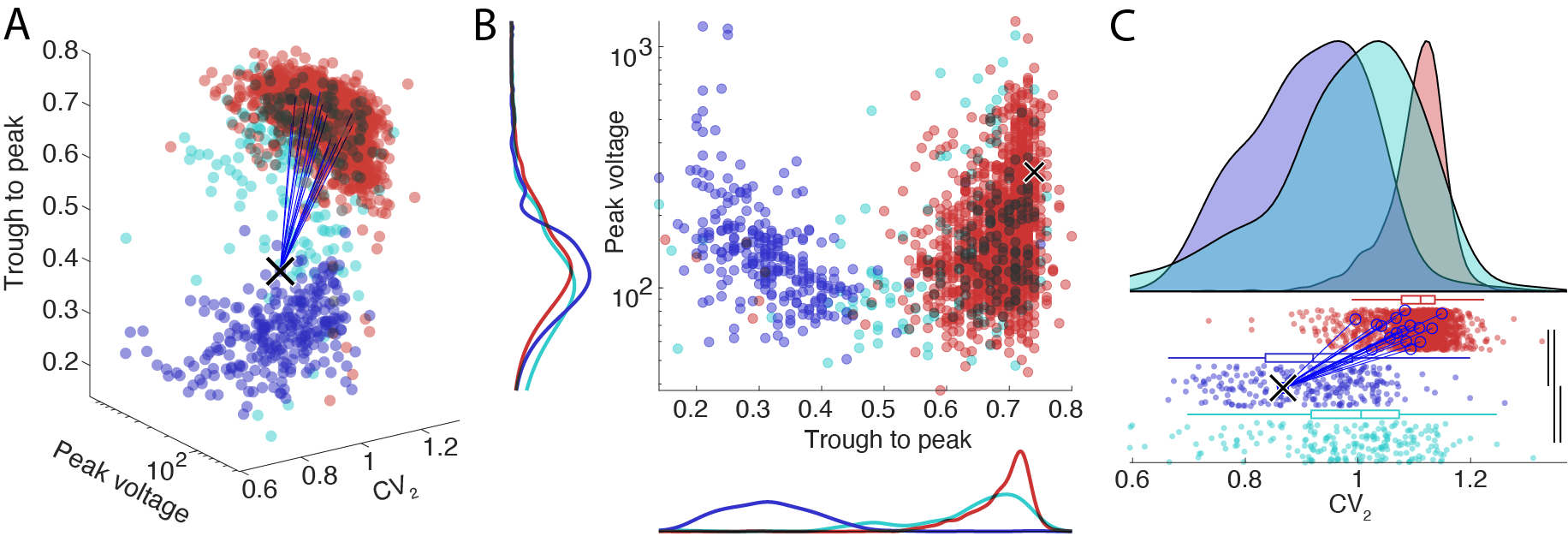
The custom group plot has three overall plotting methods.
- 2D and 3D scatter plot (3D plot shown in panel A below).
- 2D scatter plot with histograms (shown in panel B below).
- Raincloud plot (shown in panel C below).
Classical separation plot
One of the most common ways to visualize putative cell types is the trough-to-peak vs the spiking burstiness. Putative PV cells (narrow waveform interneurons) separate very nicely from pyramidal cells due to their narrow waveforms. The wide waveform interneurons are less clearly captured by these measures and show a continues overlap with both the narrow interneurons and the pyramidal cell population. In the processing module, the separation of interneurons from pyramidal cells is determined by the width of the waveforms and the shape of the ACGs, which is captured by multiple parameters.
t-SNE plot
The t-SNE plot takes any number of metrics and projects them in a 2D t-SNE space. You can define the features to use for the separation in CellExplorer, but also in the settings. In CellExplorer you can define both single numeric features, as well as waveforms, response curves, ACGs and ISIs and other available single cell features. t-SNE settings can also be set in the t-SNE dialog. From the top menu select View -> Change metrics used for t-SNE plot to alter the t-SNE metrics. This will bring up a dialog allowing you to select features and settings. Besides t-SNE, two other algorithm are also available for dimensionality reduction: PCA and UMAP (Uniform Manifold Approximation and Projection).
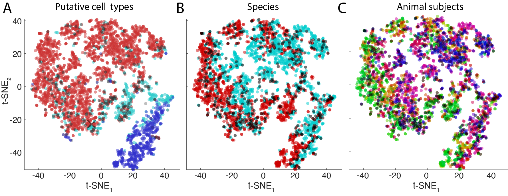 The figure above shows a t-SNE representation of a population of cells recorded across various subjects. Each neuron is represented by a point. The figure shows three color codings according to: putative cell types (panel A), animal species (panel B) and animal subjects (panel C).