Single cell plot options
The single cells can be plotted with various plot options. You can further create your own custom plots, which can be loaded and displayed in CellExplorer, by saving plot function in the customPlots folder. Most data has three plotting styles: single cell, population and a normalized image.
Table of contents
- Waveforms
- Autocorrelograms
- ISI distributions
- Firing rate maps
- Response curves
- PSTHs
- Spike rasters
- Waveforms across channels
- Trilaterated position
- Connectivity graphs
- Custom plots
- Group action plots
Waveforms
There are three types of waveform plots: single waveform with noise curves in absolute amplitude, z-scored waveforms across population, and color plot with same z-scored waveforms. Further there are filtered and unfiltered waveform plot options. 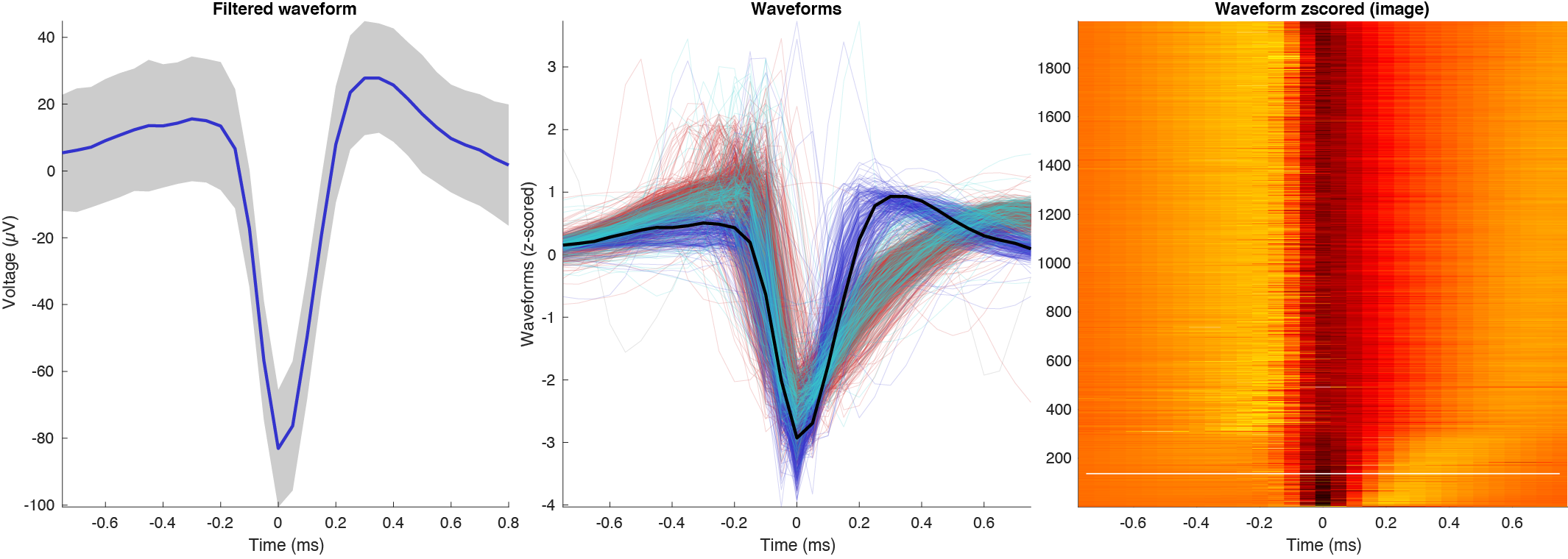
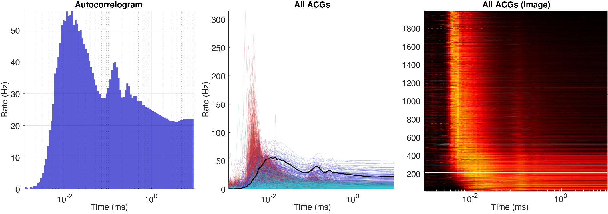
Autocorrelograms
There are three types of autocorrelograms (ACGs) all normalized to firing rates: single ACG, population plot and a color plot with z-scored ACGs. Further there are three ACG types: [-50ms:0.5ms:50ms], [-500ms:1ms:500ms] and a log10 [1ms:10s]. 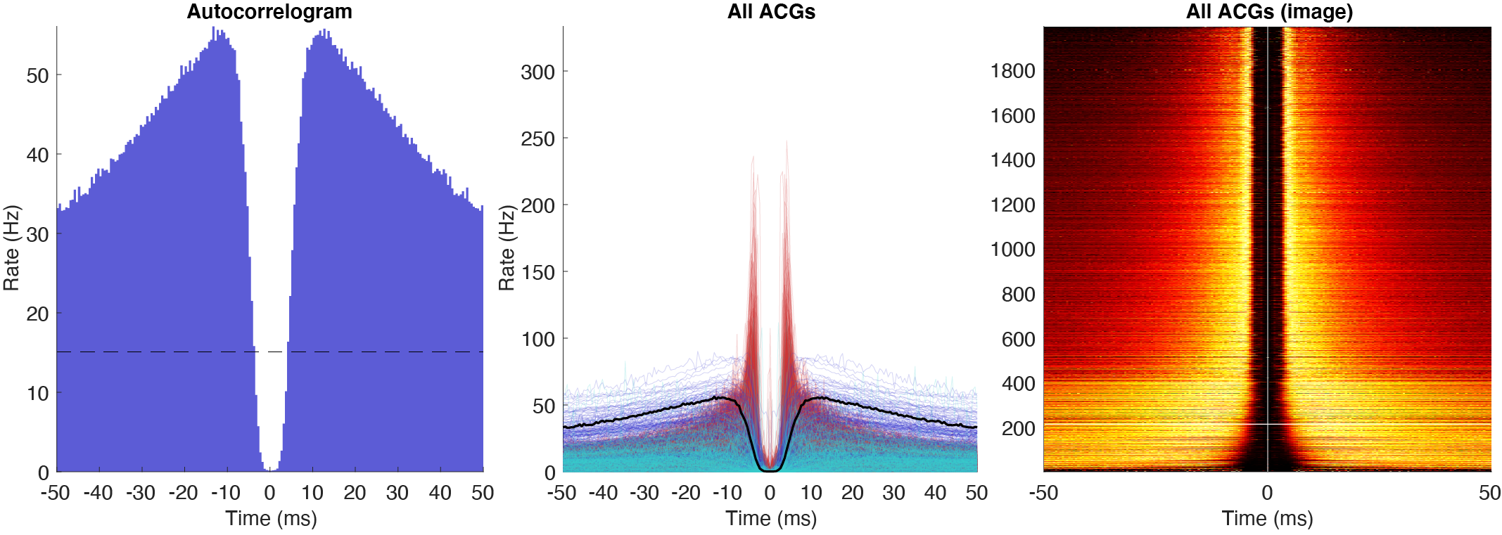
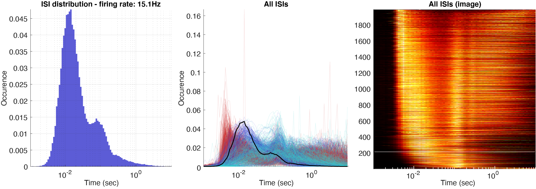
ISI distributions
Three types of log10 ISI distributions: single ISI distribution with the addition from ACG shown in the same plot, all the ISIs for the whole population, and a color plot with z-scored ISIs across the population. The normalization can further be set to three different values: occurrence, rate (normalized by bin size), and instantaneous firing rates (1/ISIs). 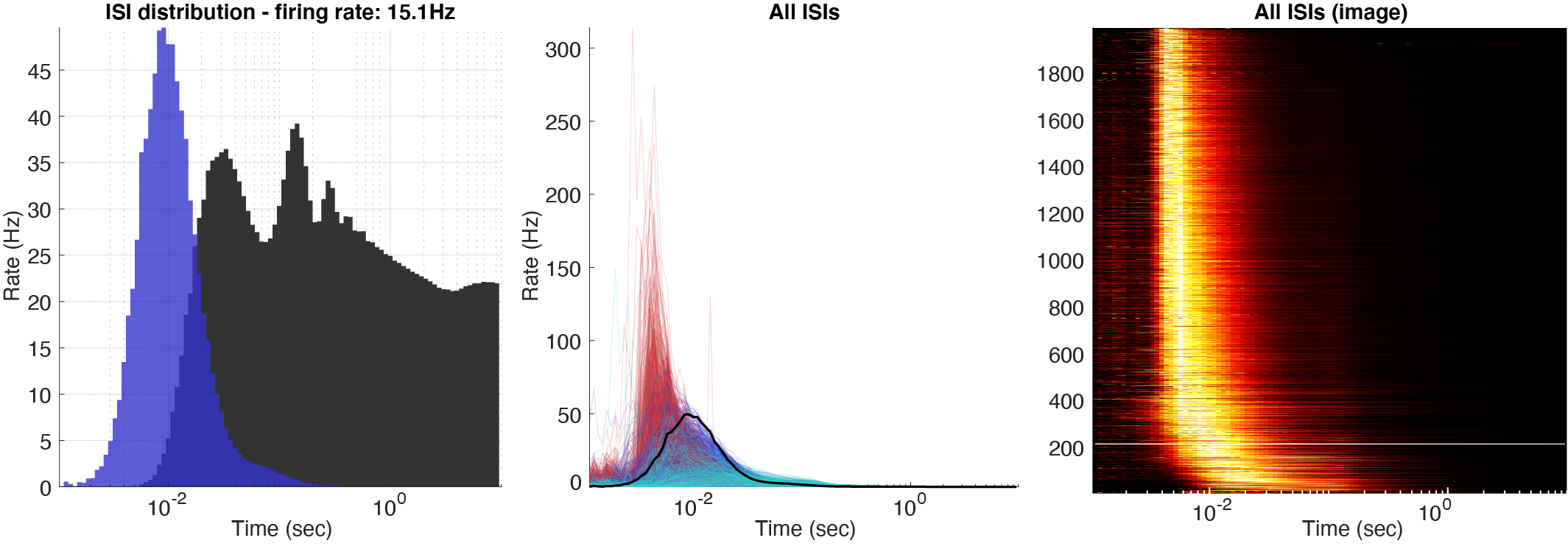
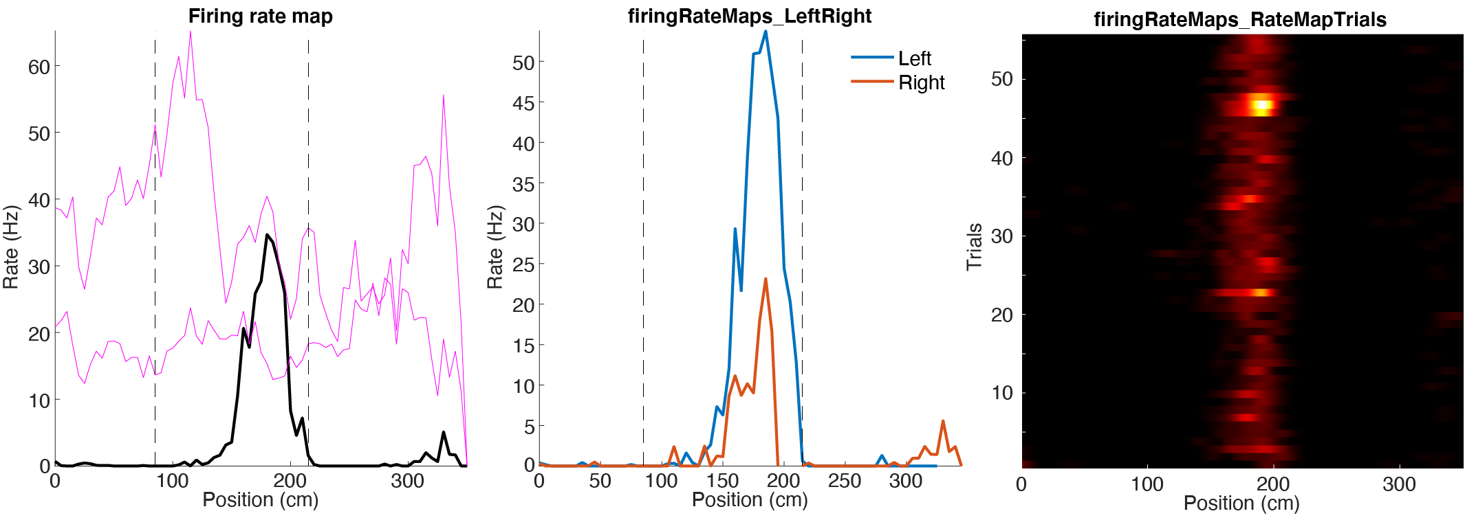
Firing rate maps
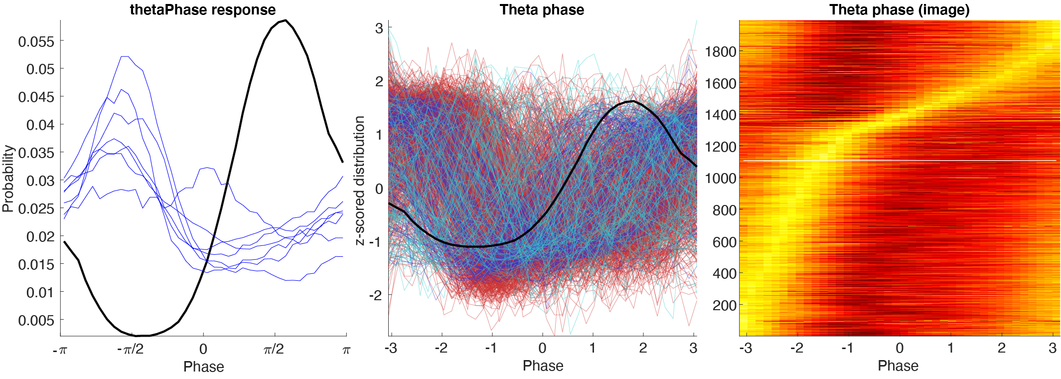
Response curves
Response curves includes firing rate across time, phase distribution. There are three plotting styles:
- Single response curve with monosynaptic cells’ response curves.
- Population response curves.
- Image with normalized response curves.
PSTHs
PSTHs can be shown for either sessionName..psth.mat files or for sessionName..events.mat. They are by default aligned to the onset of the event, but can also be aligned to the peak, center or offset.
Spike rasters
The spiking data can also be loaded to generate raster plots using spike data. Please see the tutorial on spike data to learn more. The figure below shows two raster plot examples for a pyramidal cell in CA1: 1. Theta phase vs position (the animal runs along a track), 2. Trial vs position, colored according to 3 states. 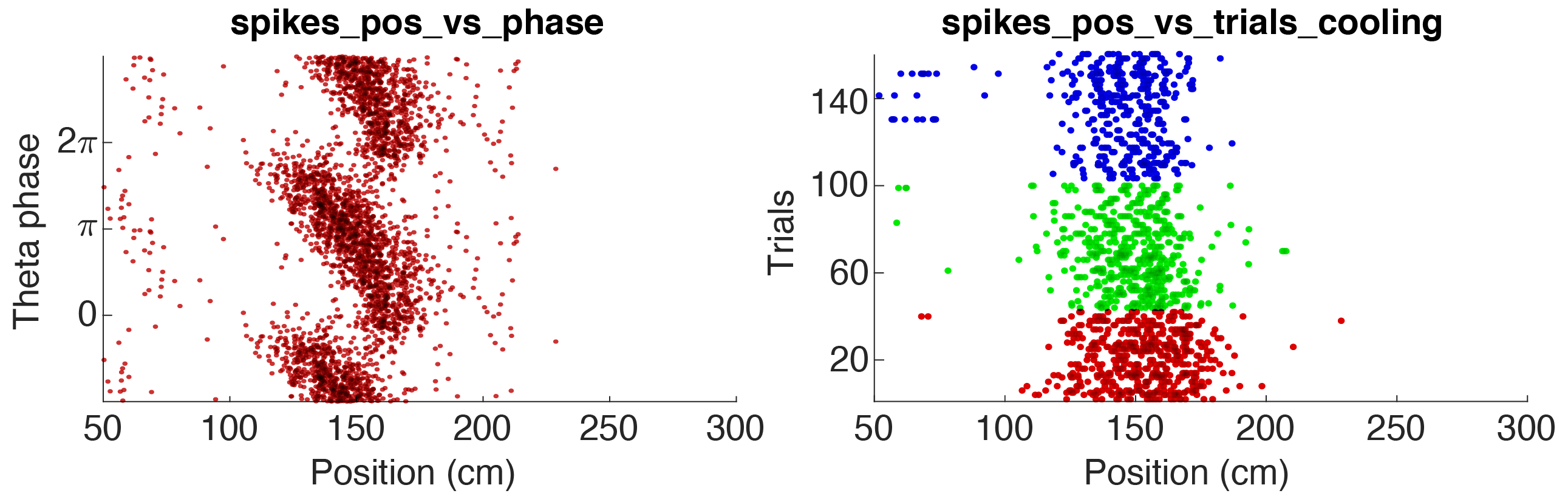
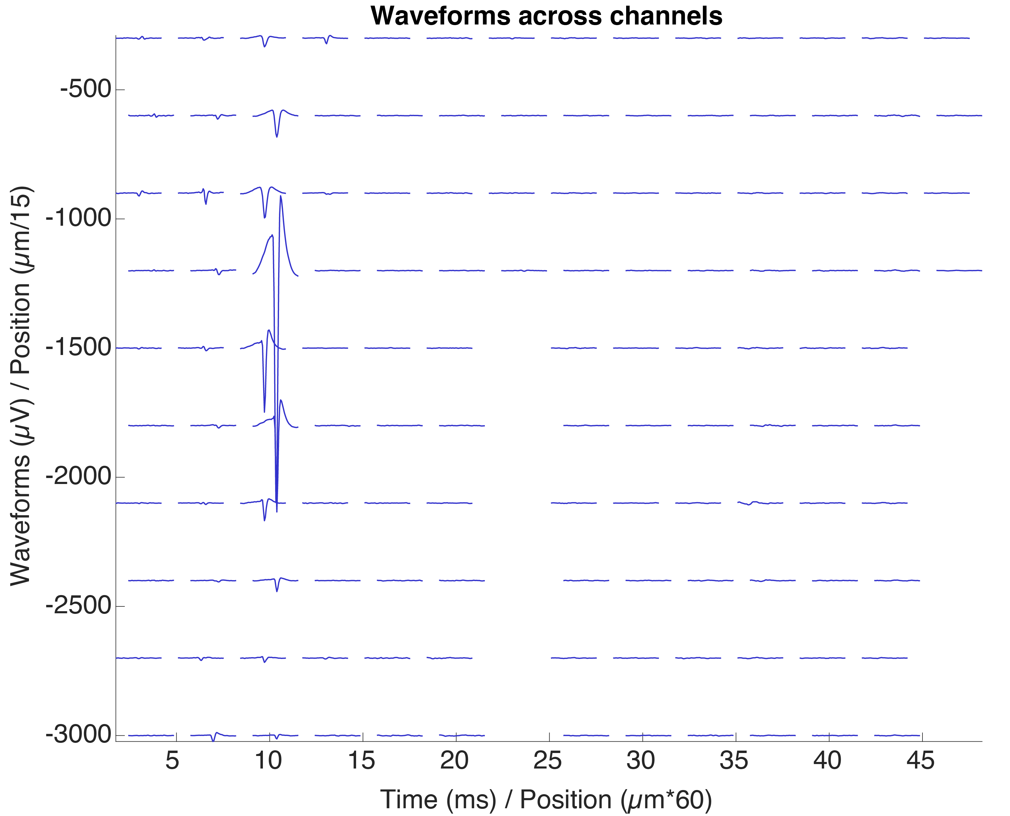
Waveforms across channels
Average waveform across all channels.
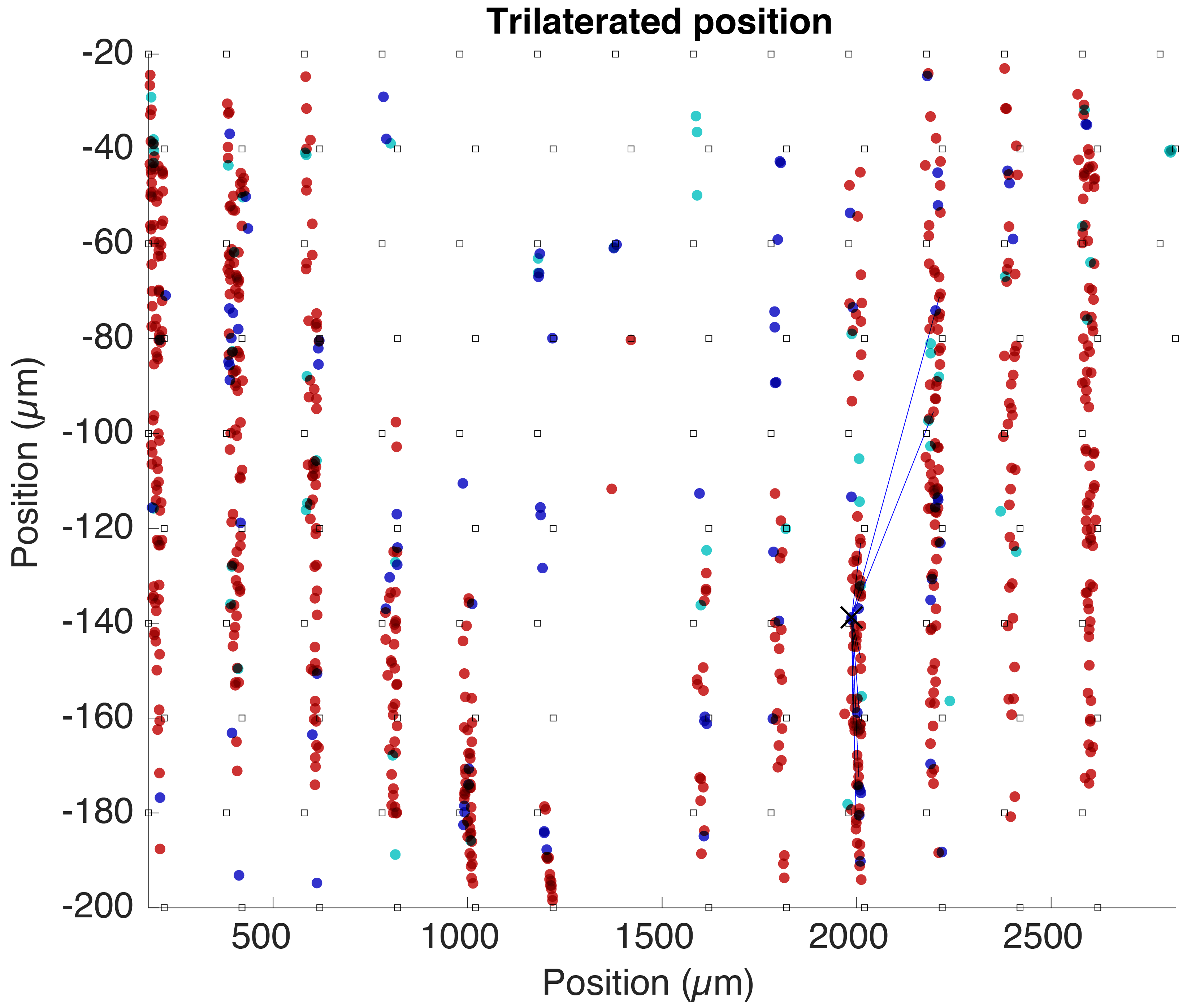
Trilaterated position
A trilaterated estimated position for all cells determined from the amplitudes of their average waveforms across channels. The squares indicate electrode sites.
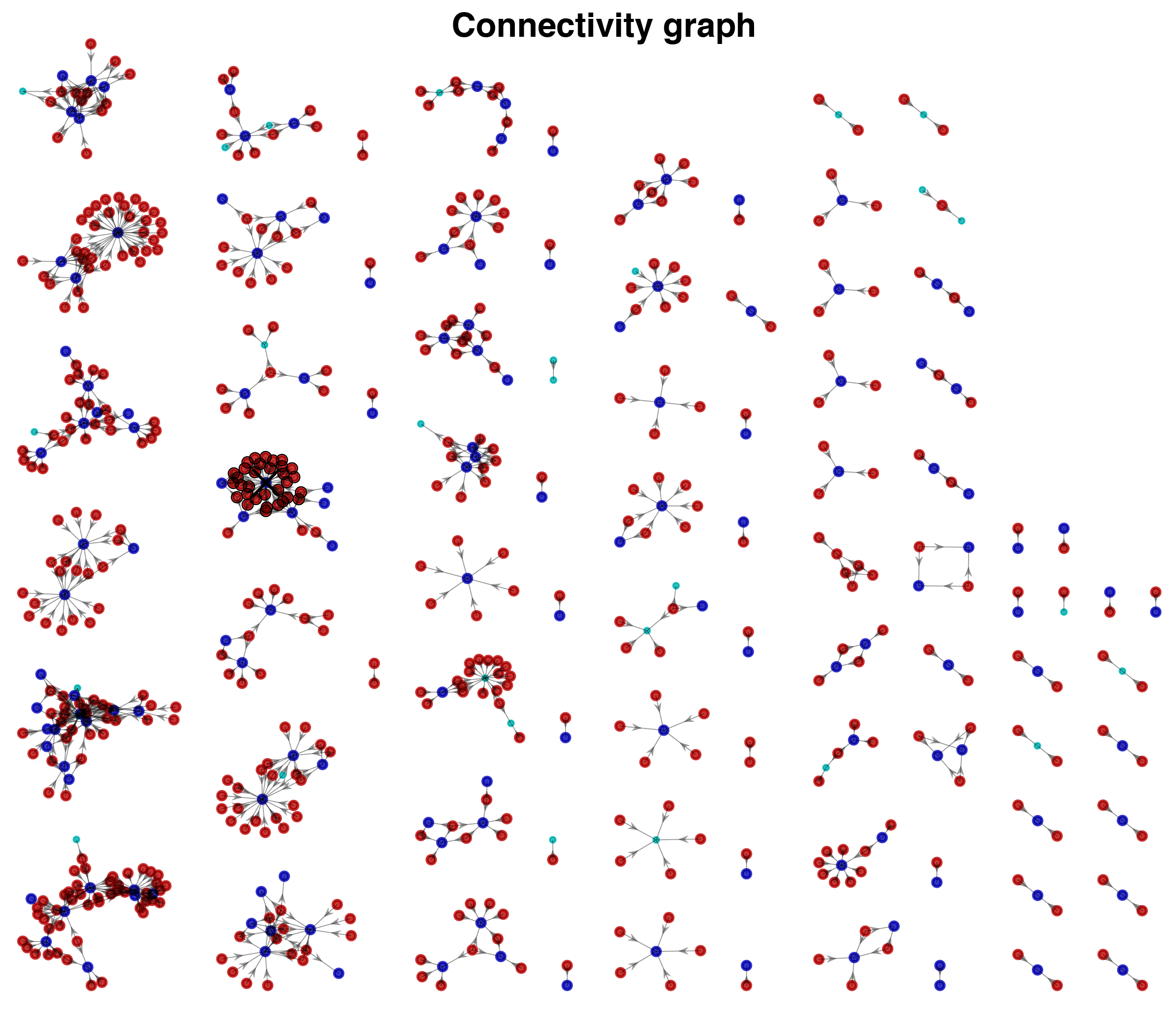
Connectivity graphs
The connectivity graphs shows all connections detected in a dataset. Selected cell is highlighted together with its synaptic partners. You can select and highlight cells from the plot.
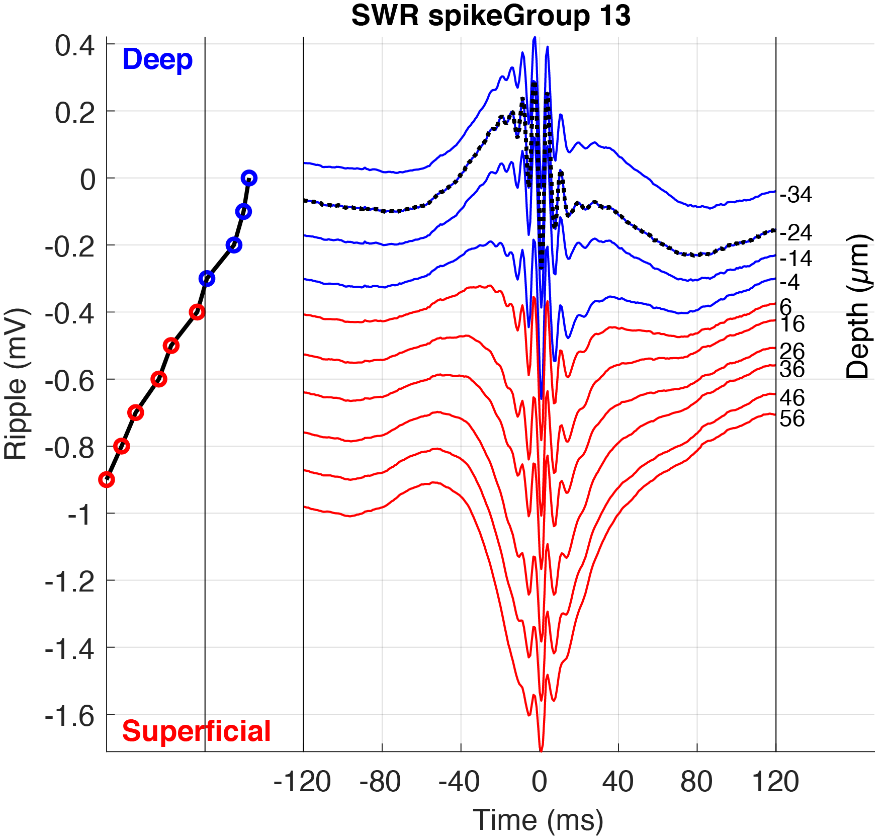
Custom plots
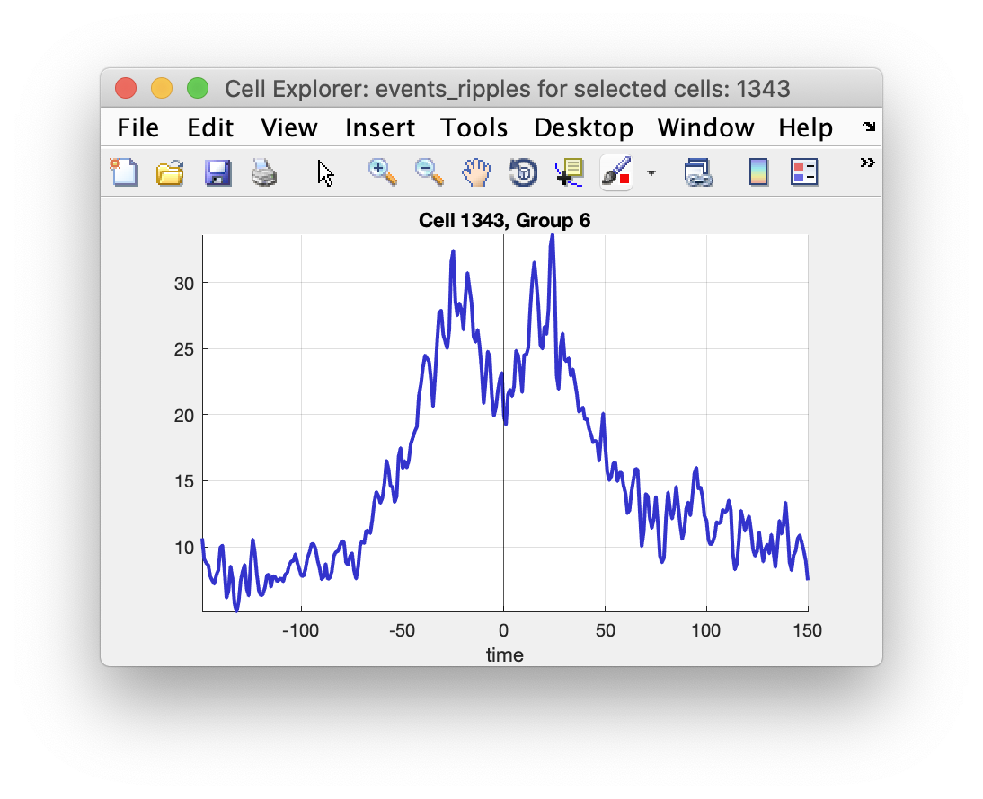
You can create your own custom plots to display in CellExplorer that also becomes interactive. Image below shows a ripple triggered average across an electrode with the current selected cell highlighted.
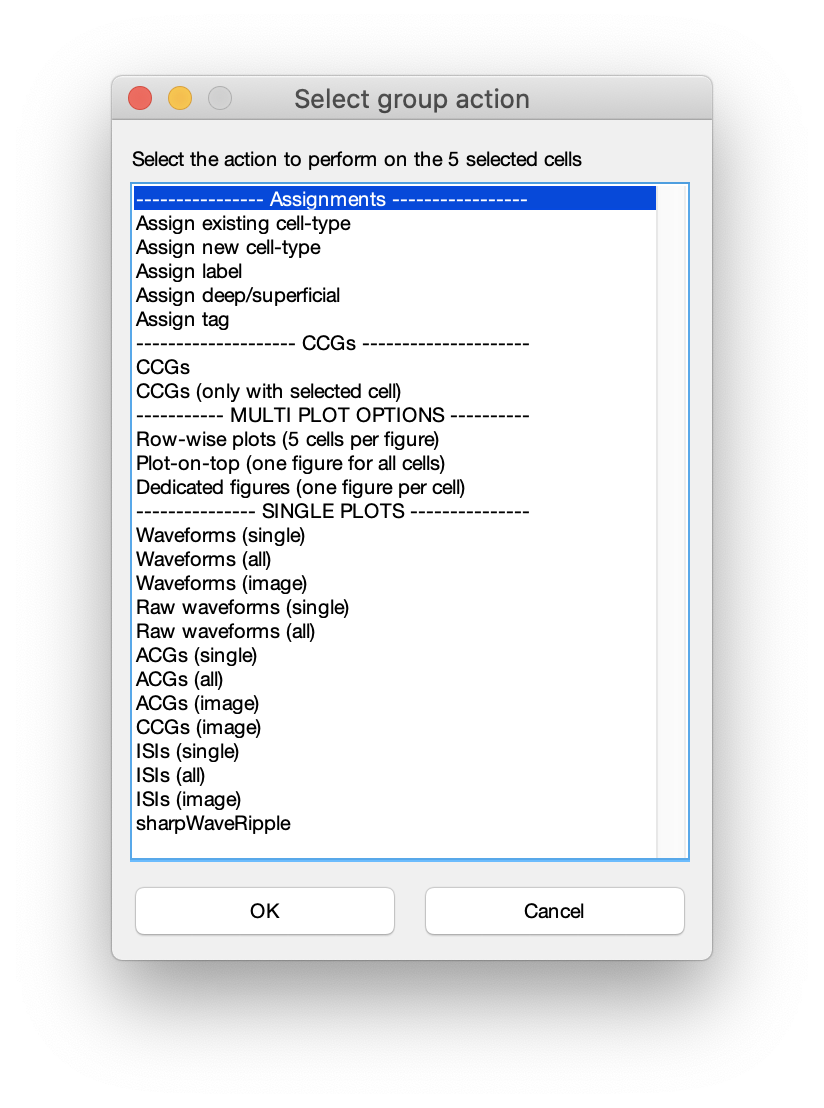
Group action plots
All plots presented on this page are single cell plots that can be selected for the 3-6 single cell subplots in CellExplorer but can also be plotted separately using the group actions menu. Select a few select cells and press space. Below menu will be shown and you can create various plot combinations from above plot options.
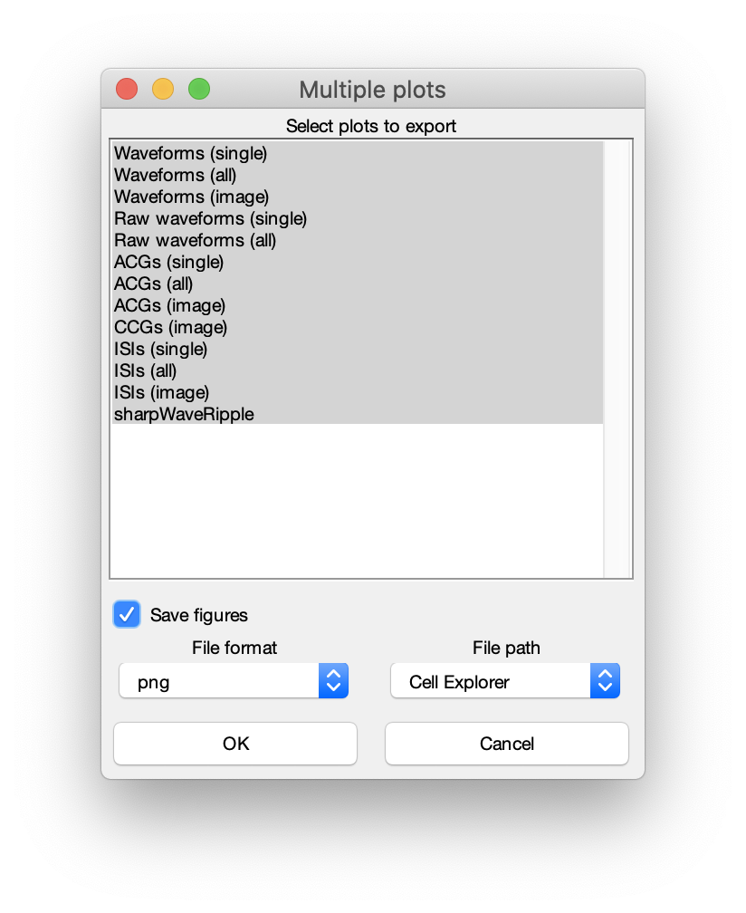
Multi plot options and figure exporting
Please see the tutorial on exporting figures.