Tutorial on plotting spike raster data in CellExplorer
This tutorial will show you how to generate raster plots using spike data. The spike data is not saved with the metrics but will be loaded separately. Events or manipulation files can also be loaded separately allowing you to generate two-dimensional rasters and PSTH raster plots. 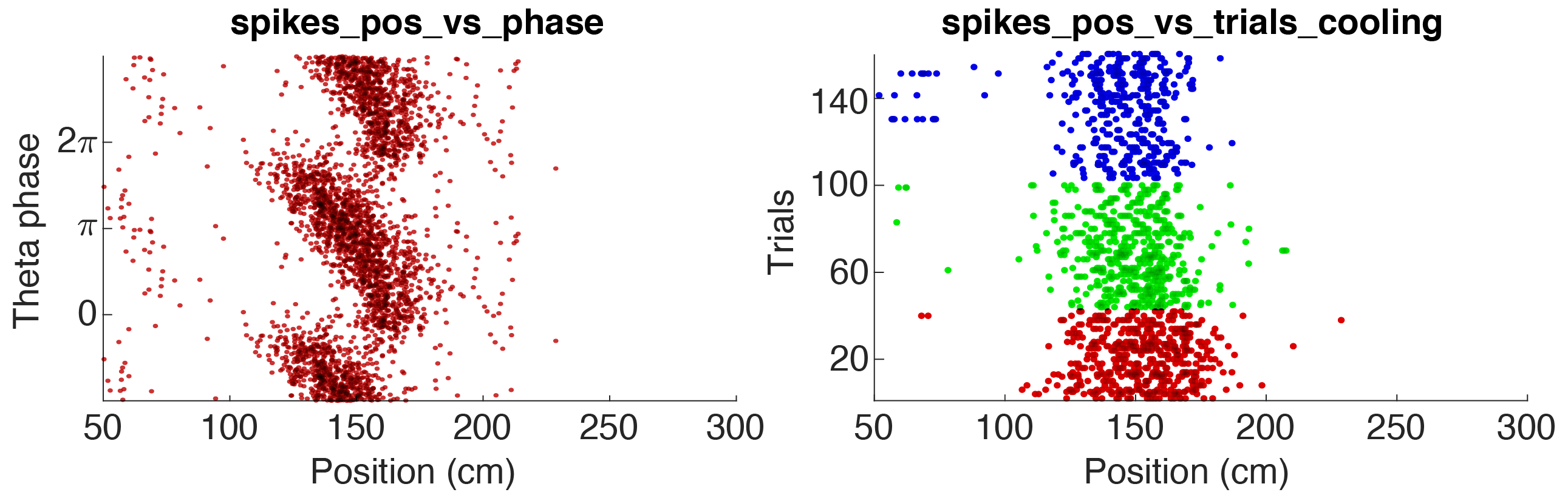
Above figure shows two raster plot examples for a pyramidal cell in CA1: 1. Theta phase vs position (the animal runs along a track), 2. Trial vs position, colored according to 3 states. The parameters used for the two examples are available in the folder +customSpikesPlots/ (further details below).
Any events or manipulation files located in the basepath will be detected in the pipeline and PSTHs will be generated. Events and manipulation files are similar in content, but only manipulation intervals are excluded in the pipeline by default.
Table of contents
Show spike raster data in CellExplorer
CellExplorer can show spike raster data using the sessionName.spikes.cellinfo.mat and related structures (sessionName.*.events.mat and sessionName.*.manipulation.mat). See the file definitions here.
- Launch CellExplorer
- Select
Spikes->Spike data menufrom the top menu (keyboard shortcut:ctrl+a). - The spike data will be loaded and below dialog will be shown in CellExplorer.
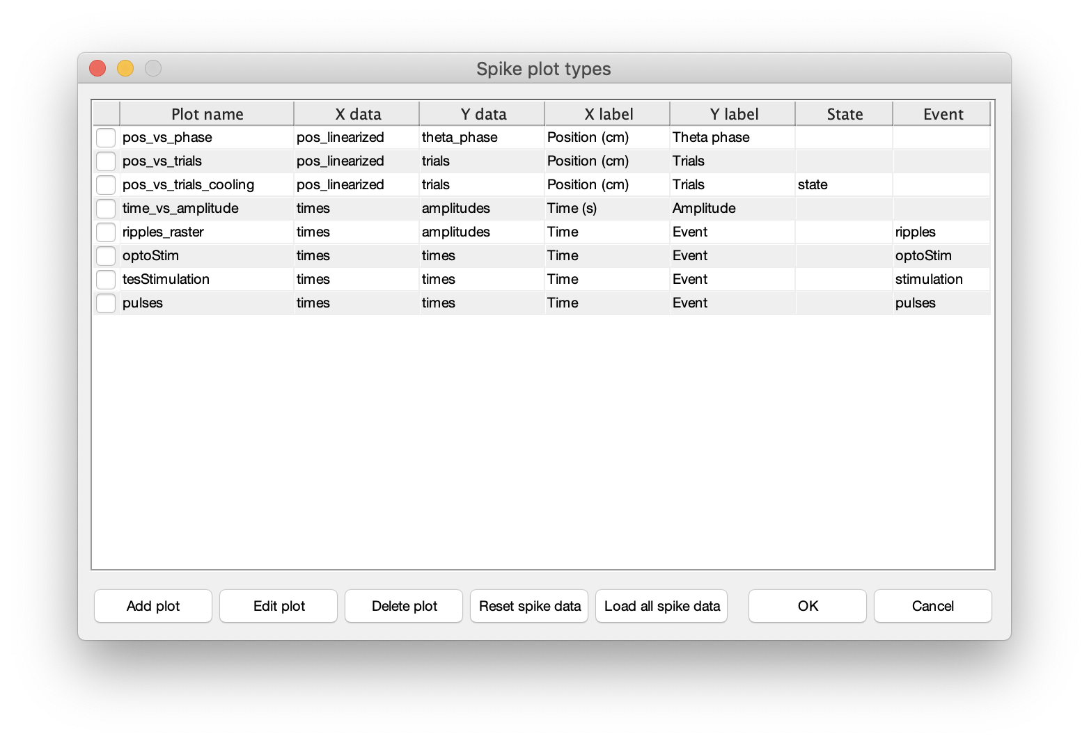
- Now, if the listed spike plotting options are sufficient. Press OK to close the dialog.
- This will add the spike plotting options to the display settings drop-down menus as shown in below image.
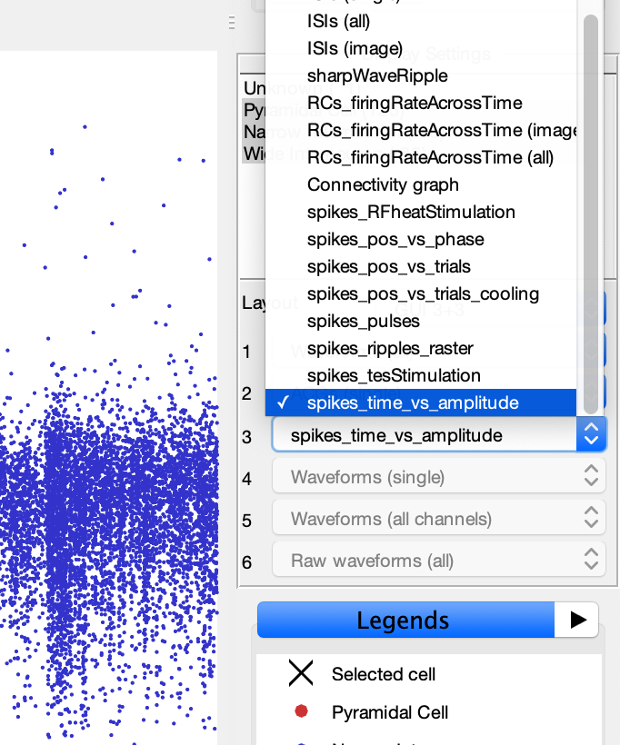
- Select one of the spike plot options to display it. This will generate a raster plot similar to the image below.
- If there are no spiking data available for the current session or the selected cell, the plot will be empty. This is also the case for datasets missing specific events files, when generating PSTH raster plots.
Create and modify spike plots in CellExplorer
- From the spike data dialog you can add, edit and delete spike plots. To add a new plot, press the
Add plotbutton (to modify an existing plot, select one of the listed plots and click theEdit plotbutton). - Below dialog will be shown allowing you to create a custom spike plot defined by the parameters displayed.
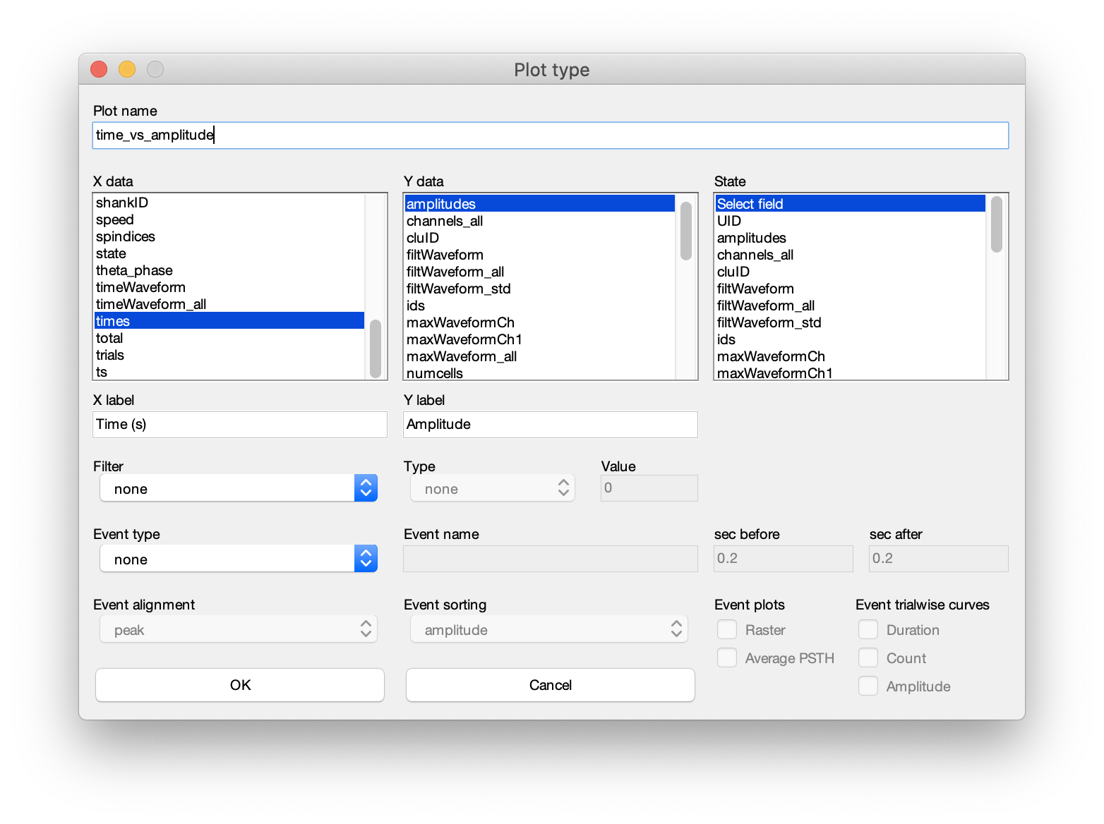
- The dialog can be separated into 5 sections. 1. Plot title, 2. x, y and state data, 3. axis labels, 4. filter, and 5. events.
- Plot nane: Start by defining the name of the plot. This must fulfill the requirement of being a valid variable name.
- x, y and state data: Next, define the fields to plot from the
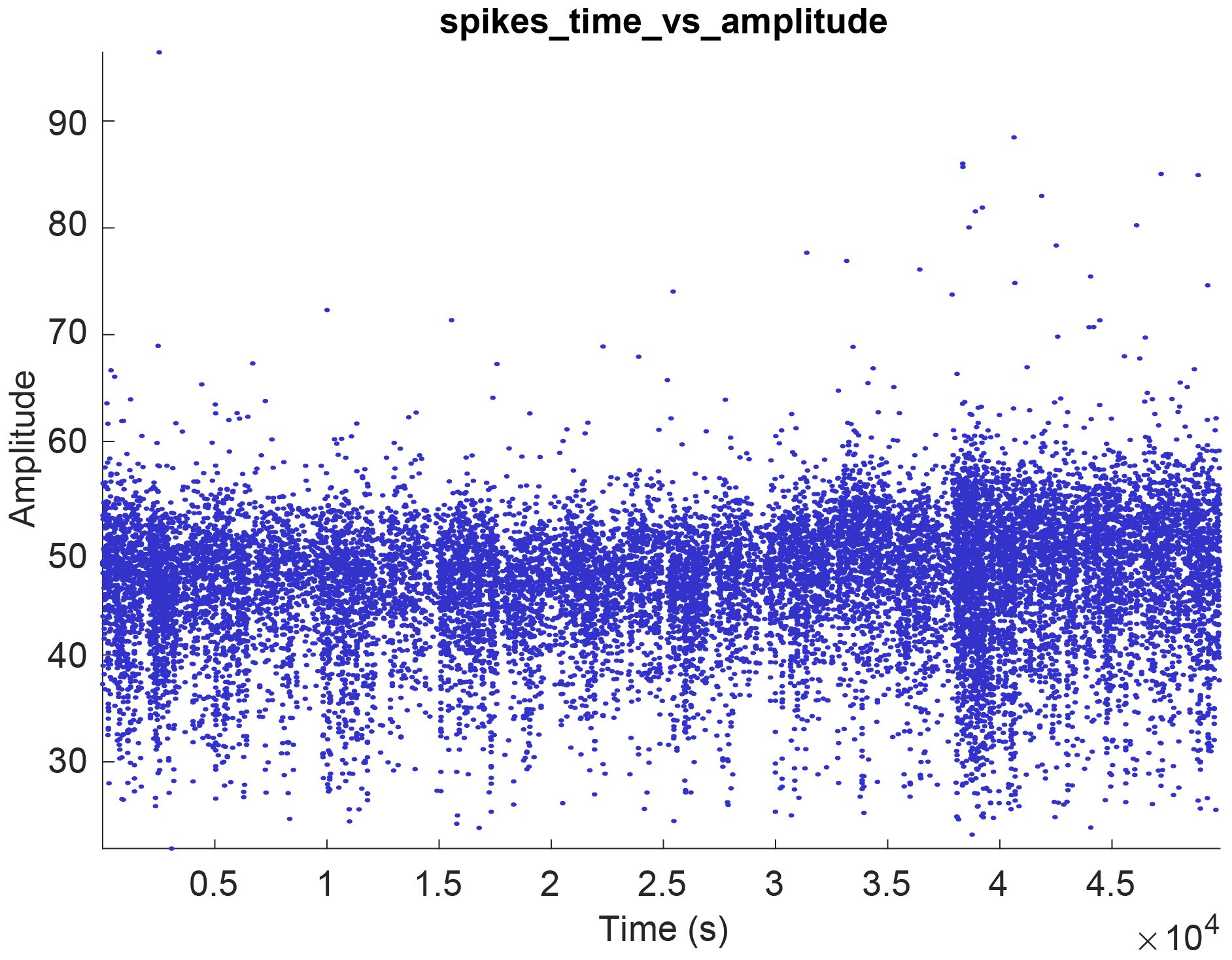
spikesstruct. The x, y and a state vector can be chosen (state allows you to color-group your data. See the second raster example at the bottom of this page). As an example, lets say you want to plot the spike amplitude across time (shown in the example above). In the x-data selection column, select times. In the y-data column, select amplitudes. - Axis labels : Provide labels (e.g. Time (s) and Amplitude as x and y labels) and press OK. This will create a new plot looking like the raster example above.
- Filter : You can also define a data field to use as a filter. E.g. amplitude or speed. Select the field you want to use a filter, define the filter type (options: equal to, less than, greater than) and the threshold-value for the filter.
- Events : You can also create PSTH-rasters using separate event data. Define the type of the event (options: events, manipulations, states files), the name of the events, .e.g. ripples (
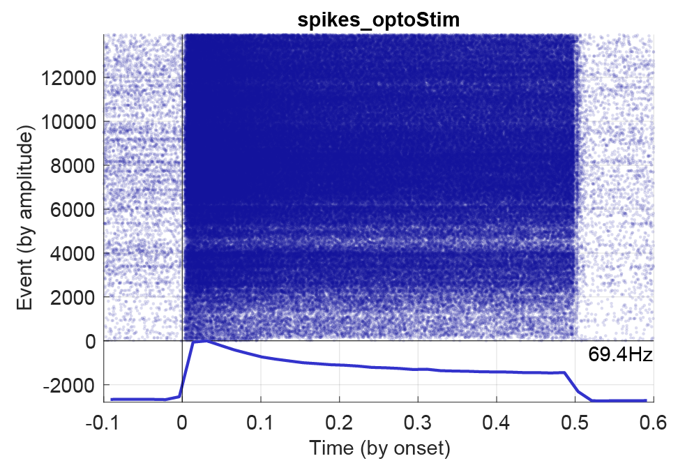
sessionName.ripples.events.mat)), and the duration of the PSTH window (time before/after alignment in seconds). Next, define how to align the events (options: by onset, offset, center or peak). Each option must be available in the events file to be plot-able, e.g. peak and offset, or be determined from other fields, e.g. center (which can be determined from the start and stop times of intervals). Using the event check-boxes you can select to display the average response and/or the raster, together with event-wise curves. Below figure shows a PSTH for an opto-stimulated interneuron with 1200 events and a stimulation window of 0.5 seconds.
The spike raster plots created in CellExplorer is not saved across sessions. To do this you have to follow the next section about predefining spike plots.
Predefine spike plots
You can predefine custom plots that are loaded automatically in CellExplorer every time. Custom spike plots are located in the folder +customSpikesPlots/. The parameters that must be defined follows the logic described in the previous section. There is a template file (spikes_template.m) available in the folder to get you started:
function spikePlot = spikes_template
% This is an template for creating your own custom spike raster plots
%
% OUTPUT
% spikePlot: a struct containing all parameters

% Spikes struct parameter
spikePlot.x = 'pos_linearized';        % x data
spikePlot.y = 'theta_phase';           % y data
spikePlot.x_label = 'Position (cm)';   % x label
spikePlot.y_label = 'Theta phase';     % y label
spikePlot.state = '';                  % state data [ideally integer]
spikePlot.filter = 'speed';            % any data used as filter
spikePlot.filterType = 'greater than'; % [none, equal to, less than, greater than]
spikePlot.filterValue = 20;            % filter value

% Event related parameters (if applicable)
spikePlot.event = '';				   % Name of struct/file
spikePlot.eventType = 'events';        % [events,manipulation,states]
spikePlot.eventAlignment = 'peak';     % [onset, offset, center, peak] alignment of the PSTH
spikePlot.eventSorting = 'amplitude';  % [none, time, amplitude, duration] event sorting metric
spikePlot.eventSecBefore = 0.2;        % in seconds
spikePlot.eventSecAfter = 0.2;         % in seconds
spikePlot.plotRaster = 0;              % [binary] show raster
spikePlot.plotAverage = 0;             % [binary] show average response
spikePlot.plotAmplitude = 0;           % [binary] show amplitude for each event on a separate y-axis
spikePlot.plotDuration = 0;            % [binary] show event duration for each event on a separate y-axis
spikePlot.plotCount = 0;               % [binary] show spike count for each event on a separate y-axis

end